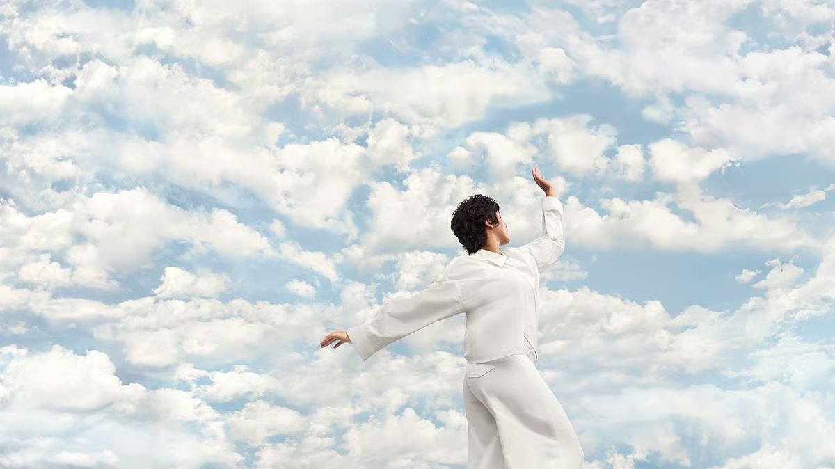
In a world crowded with stimuli, she values how the shade offers balance: “There is a bombardment of colours… this neutral shade does not influence you, but you can influence it.”
Shalini, too, finds it culturally familiar — visible in Kerala’s saris, mundu and pottery — and emotionally uplifting, a tone that “takes away from the darkness” and brings calm, much like the highlights an artist uses to create relief in a painting.
Poet and academic Syam Sudhakar approaches it philosophically. “The name sounds soothing and peaceful. I believe the hue was always here among us, long before Pantone declared it,” he says.
Syam reflects on how meaning shifts for colour. “Red may symbolise danger to some, whereas a red rose symbolises love. I would stress this shade carries no racial reading. White is not a white man’s colour.”
In his view, its role is simple and almost meditative: a presence that can “restore peace, even if briefly”.
Nithya Mariam John, a poet and assistant professor of English, has a different take. “The very concept of assigning one particular colour to express a fresh start may also be homogenising,” she says.
“Can one shade be considered an umbrella colour that paints millions of feelings about serenity, clarity, mindfulness and close reflection, all across the globe? White or not VIBGYOR, let us start afresh. That’s the bottomline.”
Inside homes, colour certainly takes on yet another function. Designer Midhun Babu finds serenity in the cosiness the Cloud Dancer offers. “It has a soft, airy warmth that diffuses light gently,” he says, noting that unlike harsher whites, it stays stable in Indian lighting.
Interior designer Ebin Francis calls it “a timeless colour that goes with most of the other elements”, especially in Kerala homes where it pairs seamlessly with both traditional and contemporary palettes.
“It never overpowers a room. Textures and layering can elevate it easily — ultimately delivering what they see as a feeling of calm and comfort,” he says.
What ties these perspectives together is the shade’s ability to step back rather than stand out. Instead of demanding attention, it creates room — for interpretation, for texture, for quiet.
And across fashion, art, design and culture, most voices converge on one idea: its power lies in what it allows rather than what it imposes. Maybe that’s the quiet shift the world needs at this point.